Key Takeaways (Quick Summary)
- Trust Signals: Users judge your credibility in 0.05 seconds.
- The “Celebrity Trap”: Don’t copy big names from your industry (like Tony Robbins) if you don’t have their fame and resources.
- Critical Elements: You need a strong “Outcome-Based” Headline, specific “Result” Testimonials, a visible Call-to-Action (CTA) and lead generation forms.
- Tech Standards: Mobile speed must be under 3 seconds, or 53% of users will leave. SSL certificate is a must.
Why do some experts struggle to charge $200 a month, while others effortlessly close $5,000 packages?
It’s rarely about the skill of the provider – although that’s important too. But mostly, it’s about perceived skill – the “Trust Signals” they send the second you land on their website.
When a potential client lands on your site, they are subconsciously asking three questions:
- What does this person do?
- Can they solve my specific problem?
- Can I trust them?
And they answer those questions fast. According to a study in Behaviour & Information Technology, it takes just 0.05 seconds (50 milliseconds) for a user to form an opinion about your website. That’s faster than the blink of an eye.
If your site fails that split-second test, you’ve lost them before they’ve read a single word.
After 20 years of building sites for agencies and businesses, I’ve noticed a pattern. The websites that actually generate revenue – regardless of the niche – all share the same structure.
They use these 12 Critical Elements to signal authority and guide the visitor to the “Book Now” button.
How many of these does your current site have? Let’s check.
⚠️ Why The Strategy that Works for Big Names Might not Work for You (Read This First)
Before we get to the checklist, a warning: Do not blindly copy the “Gurus”.
It is tempting to look at a 7-figure celebrity coach like Tony Robbins or Marie Forleo and try to mimic their strategy.
This is a strategic mistake for growing businesses.
- They have huge brand awareness and following: They can put just a photo and their name on the homepage because visitors already know who they are. You likely don’t have that luxury yet. You need to explain what you do immediately and build trust.
- They have Resources: Their complex funnels are run by 10-person marketing teams. As a solopreneur, you need a system that works on autopilot without a full-time staff.
The checklist below is designed for growth and conversion, not just fame.
Phase 1: The First Impression (Building Trust)
1. The “Outcome-Based” Hero Section
Why do you need it?
Most DIY sites waste the most valuable real estate (the top of the page, also called “the above the fold” area) with vague welcomes like “Welcome to My World” or simple labels like “Jane Doe: Life Coach”. If that part is weak, why would the user continue scrolling and not hit the back button?
The Fix: Your headline must state the result, the transformation you offer.
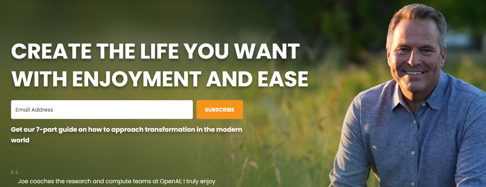
- Real World Example: Look at Joe Hudson’s website. His headline isn’t “I am an executive coach.” It’s a promise: “Create the life you want with enjoyment and ease”. He focuses on you, not him, and on the result the client gets.
- The Checklist: Does your headline tell them what they will get, not just who you are?
2. The Logo Bar (aka the “Borrowed Authority”)
Why do you need it?
According to the Stanford Guidelines for Web Credibility, 75% of users admit to making judgments about a company’s credibility based on their website’s design.
The Fix: Place a row of logos (podcasts, publications, certifications) immediately under your main hero section. This is “Borrowed Authority.” Even niche logos signal that you have been vetted by a third party. It moves you from “Amateur” to “Expert” instantly.

3. A Credentials-Based “About” Section
Why that’s important? Your story connects, but your credentials convince and convert.
- The Fix: Clearly list certifications, years of experience, or degrees. This separates you from the flood of new, untrained service providers entering the market.
4. A Real Photo of You
Why do you need it? Can’t you just use a generic stock photo with smiling people?
That would be a big NO. People don’t hire a logo; they hire a human. According to eye-tracking studies, people ignore feel-good, decorative images and photos of generic people. They will, however, spend time looking at portraits of real people.
- The Mistake: Using a stock photo of a laptop, a mountain, or a happy business person.
- The Fix: Use a high-quality photo where you are looking at the camera. Psychology tells us that eye contact builds trust. Also, bonus points if you smile! Studies show a photo of a person smiling gets a lot more user attention than that of a non-smiling person.
Phase 2: The User Experience (Reducing Friction)
5. The “Always-Visible” Call to Action (Sticky CTA)
Why do you need a CTA? And a visible one?
A Google study found that as the number of taps needed to convert increases, conversion rates drop to near zero.
There is no point in going through all the trouble of connecting with a potential client and building trust if you leave it at that. I’m guessing you also want them to actually use your services.
For that, you need to let them know what action you want them to take. Do you want them to sign up for your mailing list and get a small gift? Buy your book? Book a session? Make them clear for them what you want them to do. If a client decides they want your services, they shouldn’t have to hunt down a contact or a “book now” button. It must be omnipresent.

Also, don’t overwhelm them with options. It’s better to pick just one action for your CTAs and stick to it.
The Fix:
- On Mobile: More than 50% of your traffic is here. You need a “Sticky Bar” pinned to the bottom of the screen that says “Book a Call” – or whatever else you want them to do. It puts the next step just one thumb-tap away at all times.
- On Desktop: Ensure your “Work With Me” button is the last item in your navigation menu and stays sticky at the top as the user scrolls down the page.
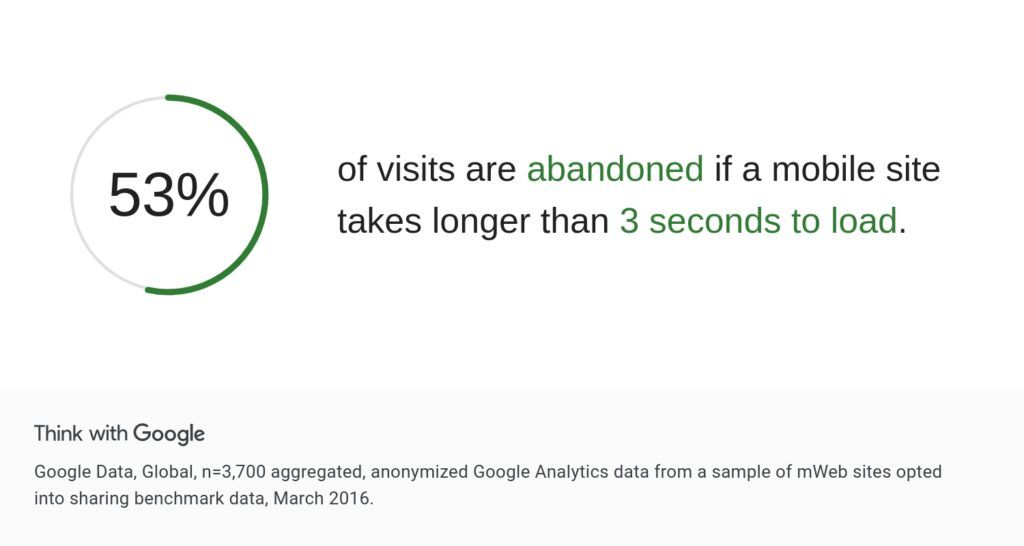
6. Website Loading Speed (Under 3 Seconds)
Why that’s important? Google data shows that 53% of visits are abandoned if a mobile site takes longer than 3 seconds to load. Busy clients don’t wait for slow websites.
- The Fix: Ensure your site loads in under 3 seconds on 4G mobile networks.
[Read: My simple guide on how to improve your site speed.]
7. No “Dead Ends”
Every page on your site needs a job.
- The Fix: A visitor should never reach the bottom of a page and find nothing. Always guide them to the next step (e.g., “Read Next,” “Download the Guide,” or “Book a Chat”).
8. Easy-to-Find Contact Info
Why? Don’t make them hunt for a way to work with you.
- The Fix: A “Work With Me” link should be visible in your main menu at all times – not buried in a footer or a sub-menu.
Phase 3: The Content Strategy (Proving Competence)
9. The “Methodology”
Why that’s important? Amateurs sell “coaching sessions.” Pros sell a “Transformation System”.
- The Fix: Create a simple graphic or list outlining your unique process (e.g., “The 3-Step Clarity Framework”).
- Example: Marie Forleo doesn’t sell “business school”; she sells “B-School.” Branding your methodology proves you’re not winging it, you have a repeatable roadmap.

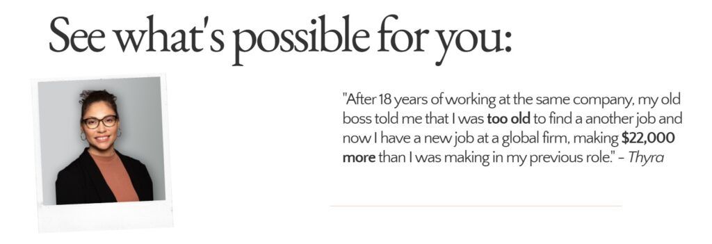
10. Specific Outcome Testimonials (Instead of Generic Ones)
Why testimonials that talk about specific outcomes are more convincing? For once, generic sounding testimonials sound fake. If your ideal client, who has a particular problem that want to solve, lands on your site, they want to be convinced you understand that problem and are able to solve it. “Jane is nice. Good communication” is not convicing anyone of anything.
The Fix: Use testimonials that mention a specific financial or emotional shift.
- Weak: “I loved the sessions.”
- Strong: “I secured a $10k raise within 3 months of using this framework.”
11. The Lead Magnet
Why do you need a lead magnet? The average website conversion rate for a service is often under 2%. That means 98% of people leave without buying. If you don’t capture their email, you lose them forever.
The Fix:
- Offer: A “Lead Magnet” (a free guide, checklist, or video) in exchange for an email.
- Bonus: Use an Exit-Intent Popup to trigger a final offer (“Wait! Before you go, grab my free 5-step checklist.”) when a user tries to close the tab. This “safety net” can recover 10-15% of abandoning visitors.
Phase 4: The Tech
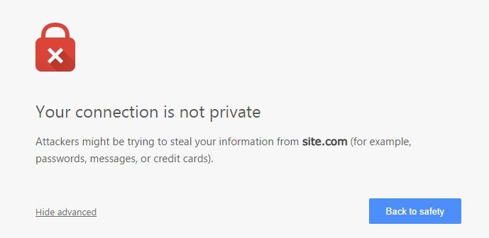
12. Security (SSL)
Why a SSL certificate is a must? If your browser bar says “Not Secure,” you look like a risk.
- The Fix: In 2026, an SSL certificate (the padlock icon) is non-negotiable. Without it, browsers like Chrome actively warn users not to enter their information on your site.
The Verdict: How Does Your Site Stack Up?
If you are missing half of these elements, you aren’t just missing “features” – you are missing the trust signals that make high-ticket sales, or any sales for that matter, possible.
The good news? You don’t need to guess where the holes are.
I’ve created a simple diagnostic tool to help you check your site against these 12 benchmarks.
📊 Free Tool: The Website Conversion Scorecard
Take this 2-minute quiz to see if your website is set up to convert or if it’s leaking leads.
You will get:
- Your “Conversion Score” (0-100%).
- A checklist of exactly which trust signals you are missing.
- Tips on how to fix them.
[Click Here to Get Your Score]
(Note: Most DIY websites start around 40-50%. The goal isn’t perfection right now; it’s identifying the gaps so you can close them.)
Frequently Asked Questions (FAQ)
Q: Do I really need a website to sell high-ticket services?
A: While you can start with a Google Doc, scaling past $5k/month usually requires a professional “home base” to build trust with cold traffic who doesn’t know you yet.
Q: What is the most important page on a service business website?
A: The Home Page is crucial for the first impression, but the “About Page” is often the second most visited because clients want to verify who they are hiring.
Q: How fast should my coaching website load?
A: Ideally under 2.5 seconds. Anything over 3 seconds on mobile will significantly hurt your conversion rates.